Let’s dive together into the depths of a large scale template versioning for a white label streaming application.
The context
Today, at Bedrock, we are providing a streaming service on:
- 11 common CTV platforms: Tizen, Philips, WebOS, Hisense, Panasonic, Orange, Xbox, PS4, Orsay, Smart Alliance, WhaleOS
- 6 Android platforms: mobile, AndroidTV, Bytel, Free, SFR, FireTV
- 2 Apple platforms: iOS / tvOS
- 1 Web platform
- a lot of specific devices
Each of these platforms has their own guidelines and usage (interaction, screen sizes, etc) and is managed by a dedicated team in our organization. They also have their own native design components which our implementations rely on to offer the best possible experience.
Bedrock has several clients (M6+, Videoland and others), that all have their dedicated application on each platform. But they also have their own design expectations and branding guidelines.
We provide them with a design system: a set of visual assets they can use to render pages. These components follow the atomic design model, which means that each layer is a composition of the previous one. Here is the list of the layers with their name and some items that belong to it:
- 14 tokens: base element that defines the brand (ex: Colors, FontSystem, Radius, Shadow, Breakpoints, Treatments…)
- 9 atoms: simplest design item that cannot be decomposed (ex: Icons, Avatar, CheckBox, ProgressBar, ServiceIcon, Separator…)
- 62 molecules: group of atoms that forms a visual unity (ex: Card, Poster, HorizontalCard, Button, CTA, Portrait, Totem…)
- 12 organisms: complex visual item or part of the interface (ex: Jumbotron, Hero, Solo, Banner…)
Hereunder are some sample screens composed of design system components for different customers:
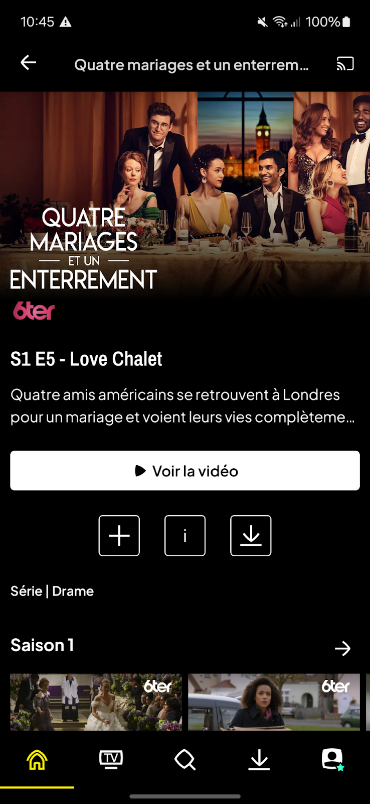 |
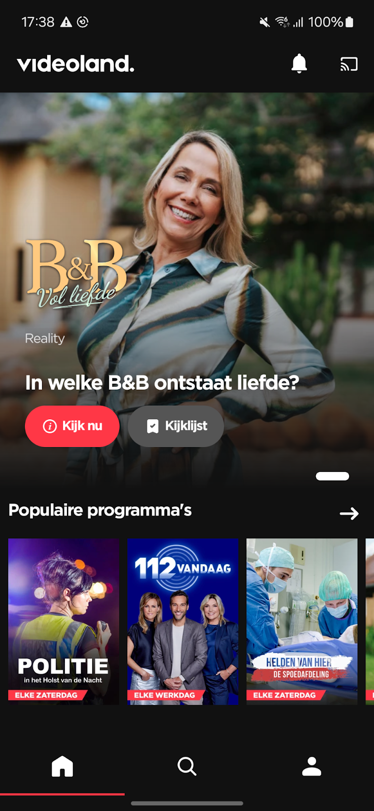 |
 |
This results in approximately one hundred design elements per client. However, not all components are always specific, and an inheritance system is in place to allow clients to reuse default atoms, molecules, or organisms while applying the tokens corresponding to their brand.
The objectives and expectations regarding the design vary greatly among clients, resulting in numerous graphical element evolutions. Managing the creation and progression of these elements through different processes is a major challenge in tracking designs across each platform. These demands sometimes lead to different integrations. Whether or not the default design is inherited is crucial information to avoid manually comparing the app designs with documentation, which can lead to misunderstandings and wasted time during validation and approval processes.
To achieve all these objectives, we need to be able to carefully follow the evolution of the design system on each plateform.
One versioning to rule them all
Therefore, implementing a versioning system became essential to continue enriching and evolving our client’s design systems.
To ensure its interest and effectiveness, this system had to address several issues:
- Be specific per platform and per client: evolution progress does not occur at the same pace across all platforms. This also allows for comparing design progress between platforms.
- Allow visualizing the inheritance between the default design system and the client’s specific part on the same platform. We also wanted the ability to add comments on implementation details.
- Be directly accessible with each build to stay in touch with the application it represents. On mobile, many builds are generated daily, making it difficult to track the arrival of new features.
- Stay up-to-date with the constant evolutions of the design system to maintain the source of truth.
Exemple of a Design System release note:
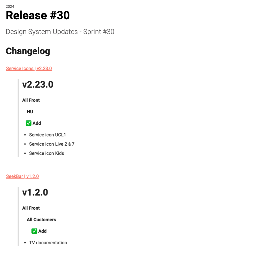
Initially, the design team started by versioning its releases and all available components, which are accessible to technical teams in our online design documentation (hosted on zeroheight). This versioning is common to all platforms and all clients if there are no specificities for the component in question. Ultimately, versioning helps product and technical teams track the delivery progress of new designs. The version number follows these rules:
| Code status | Stage | Rule | Example |
|---|---|---|---|
| First release | New collection | 1.0.0 | 1.0.0 |
| Documentation update without impact on the anatomy of design element | Documentation update | Increment the third digit | 1.0.1 |
| New backward-compatible feature | Minor release | Increment the 2nd digit and reset the third | 1.1.0 |
| Change on element that breaks backward compatibility | Major release | Increment the first digit and reset the second and the third | 2.0.0 |
Each frontend team were then responsible for implementing an equivalent versioning system representing the state of their platform. This was done through a feature team including all front-end teams, design system managers, and the product team. This organization brought numerous benefits:
- Facilitating the synchronization and homogeneity of product templates
- Sharing development challenges
- Limiting versioning differences between all fronts
- Sharing industrialization ideas
Case study: Android versioning challenges
For Android, we sometimes have different component implementations between mobile and TV, evolving at different paces. This required two separate versionings to represent them. Moreover, we currently use comments to track the migration to Google’s new view system (Compose), which is happening alongside graphical evolutions.
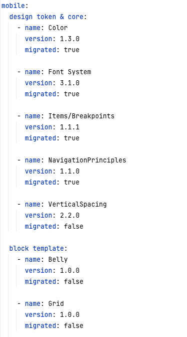
Each client has its versioning file containing all the components available on the targeted platform. Regarding component inheritance from the default design system, there are two possibilities:
- The component is inherited and thus has no specificities and no version in the client’s versioning file, using the generic Bedrock customer version
- It has its own implementation and its associated version
| Default Versioning file | Customer Versioning file |
|---|---|
 |
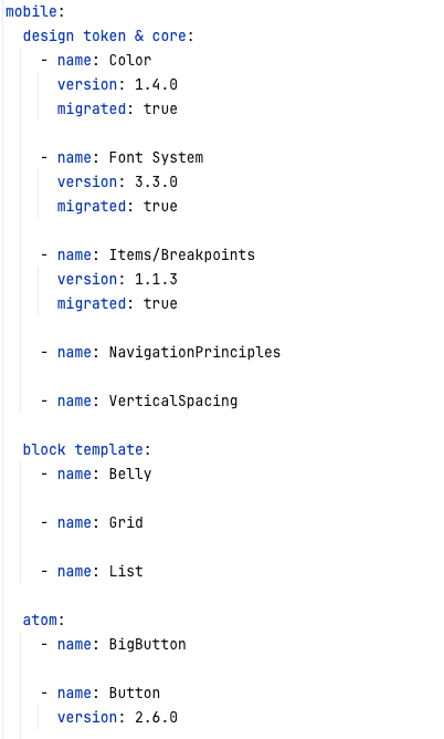 |
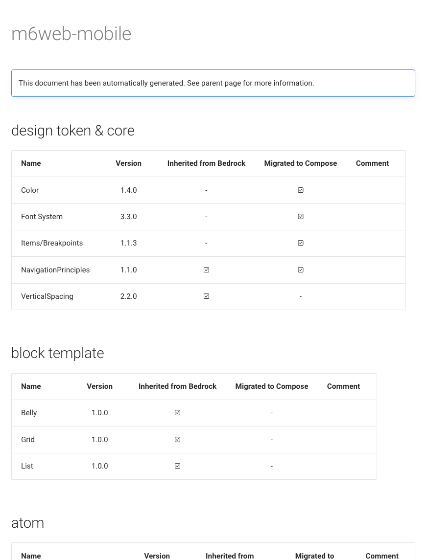
From these versioning files, we have been able to generate reports for each platform containing only the available graphical elements and their version, whether inherited or not. To track their growing number, we opted for automatic generation of these reports with each build using a Gradle Plugin integrated on our continuous deployment and integration (CI/CD): Bitrise. Now, they are generated using a Mkdocs plugin to be published online automatically with our technical documentation.
Automatically generated template versioning report for M6+:
Conclusion
Design system versioning reports offer a quick and exhaustive overview of the design system at any given moment for any of our customers and simplifies the QA teams validation work. It is now an essential tool for tracking design progress across all supported platforms.
However, improvements are always possible:
- Currently, developers are responsible for updating the versioning file when adding or modifying graphical elements, which can lead to errors and omissions. To avoid this, we would like to link the concrete implementation of the component and its version in the versioning file. But as we are still using the android legacy view system, component can be a class but also some xml style or theme or even resource files. This should be easier after the migration to the new Android view system Compose.
- Access through Bitrise is not ideal. We currently centralize all generated builds (using CI as well) in Airtable. A link would be preferable and more visible.
These last improvements will perhaps be the subject of a follow-up to this article. Thank you for reading, we hope you found some useful information that can help you to better follow the graphical evolution of your project. Do not hesitate to contact us if you have some questions or suggestions.
